A test metrics dashboard is a communication tool that displays data visualization in the form of a dashboard. The information contains testing metrics, key performance indicators (KPIs), and key information about the performance of software or a digital product that’s being tested. Through the use of data visualization, dashboards simplify complex data sets to provide viewers with an awareness of the project’s current performance quickly ‘at a glance’. In this post, learn the important dos and don’ts of designing a metrics dashboard to ensure your design provides the greatest insights and value possible.
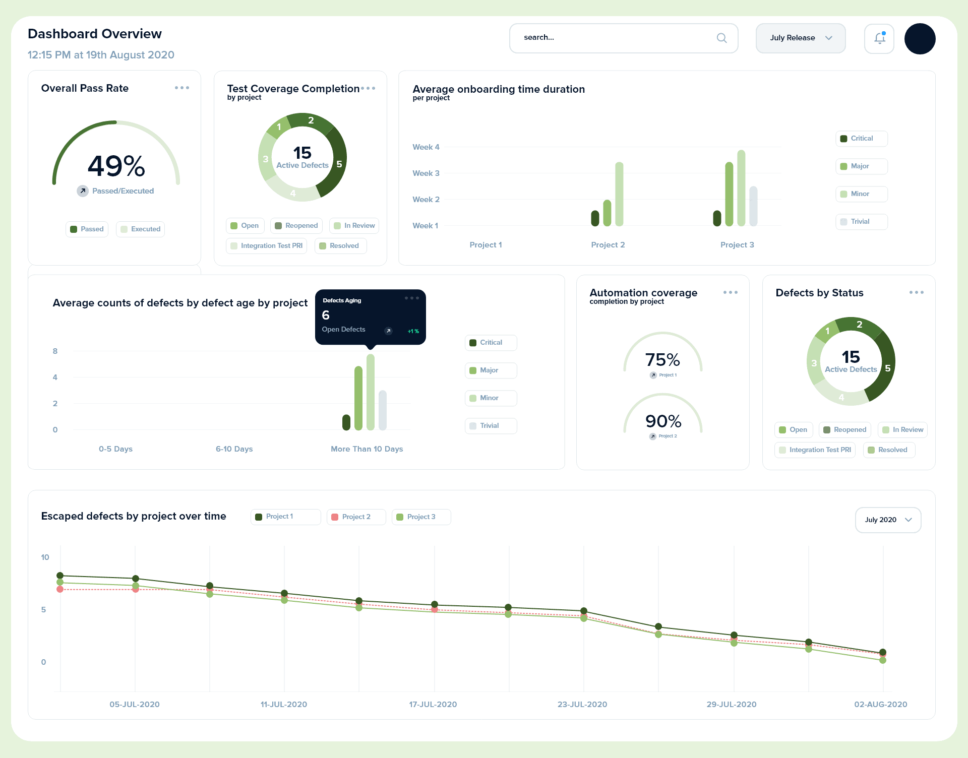 Mockup Metrics Dashboard
Dos of Metrics Dashboard Design
1. Know your audience
Consider your audience’s technical knowledge, familiarity with the system, and goals when creating a dashboard to ensure they are able to comprehend the information displayed on the dashboard. There are two main audiences:
- Project Team – highly technical and more detailed data
- Senior Management – non-technical and high-level metrics
2. Choose the right type of KPIs
One of the main purposes of a metrics dashboard is to provide project and governance teams data to review and take required actions to improve product quality. In order to do so, you must choose the right meaningful data that will help clearly indicate the project’s performance. There are two main levels to categorize KPIs based on their purpose:
- Operational Test Metrics – Reviewed by the project team to monitor and control day-to-day testing efforts
- Strategic Test Metrics – Reviewed by the Senior Management to monitor and control program-level goals and take corrective & preventive measures
Find the list of metrics you should use for your dashboard.
3. Pick the right type of charts
Metrics data might work with multiple chart types, but in most cases, some chart types are better than others. Learn the different types of charts and graphs to make sure that your message is clear and accurate.
4. Round numbers consistently
As a general rule of thumb, don’t use more than 1 or 2 decimal points, and if the rounding affects the comparison then re-think the units.
Don’ts of Metrics Dashboard Design
1. Don’t use misleading metrics
Don’t track metrics that aren’t useful when measuring the success of the project. You need to understand which metrics are most predictive of success based on your goals before you build your data dashboard around the wrong metrics.
2. Don’t use invalid sources
The data sources should be taken directly from the tools instead of taking from a team member – this ensures the validity and consistency of the data. Ensure the timeliness of your data to ensure that you’re using up-to-date information
3. Don’t forget to add a filtering or sorting option
An option to filter or sort through the available data can help users compare the project’s performance over time. Interactive data display plugins are widely available and are reasonably simple to plug into your system.
Metrics dashboards are powerful communication tools that can improve process and product quality, but they need to be built correctly to be truly beneficial. Keep these dos and don’ts in mind as you start creating your dashboards and you’ll be on your way to success.
Have a testing team, but not sure how to get them started and keep them on track? Need a testing team, but not sure what you’re looking for? Our PLATO test advisory services are here to help. Get in touch and we can help you build your testing roadmap.